Stop Guessing and Start Analyzing with These DMAIC Strategies

Why the DMAIC Analyze Phase Is Where Data Becomes Insight
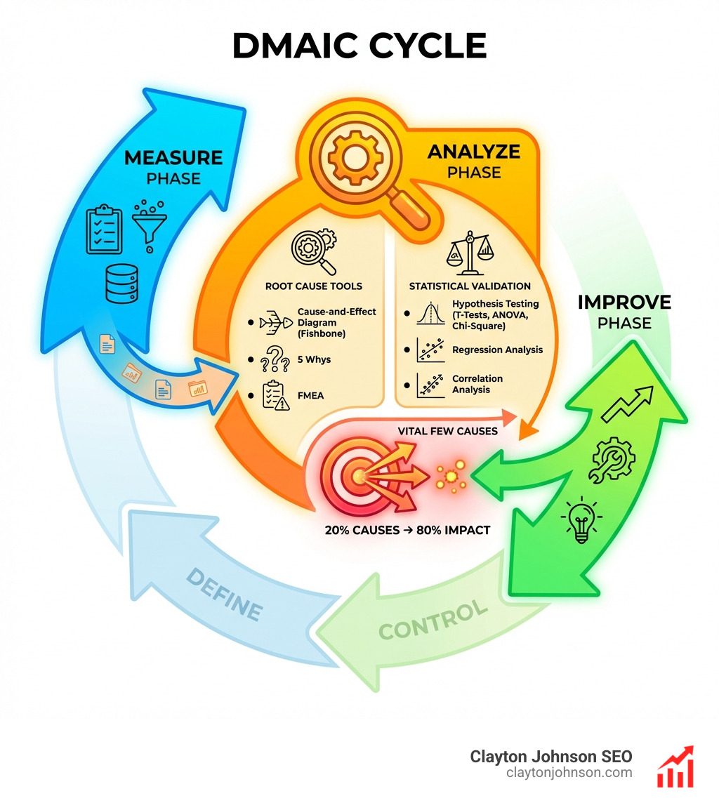
DMAIC analyze phase tools are the methods and techniques used to identify root causes of process problems through data analysis, statistical validation, and systematic investigation. Here are the most essential tools you’ll encounter:
Root Cause Analysis Tools:
- Cause-and-Effect Diagram (Fishbone/Ishikawa) – Maps potential causes across categories
- 5 Whys – Asks “why” repeatedly to drill down to underlying issues
- Failure Mode and Effects Analysis (FMEA) – Prioritizes potential failure points
Statistical Validation Tools:
- Hypothesis Testing (T-Tests, ANOVA, Chi-Square) – Confirms statistical significance
- Regression Analysis – Quantifies relationships between variables
- Correlation Analysis – Identifies patterns and dependencies
Graphical Analysis Tools:
- Pareto Charts – Highlights the vital few causes
- Histograms – Shows data distribution patterns
- Scatter Plots – Reveals variable relationships
- Box Plots – Displays variation and outliers
If you’ve collected data in the Measure phase but feel stuck turning numbers into actionable insights, you’re not alone. Most Six Sigma teams struggle here—not because they lack data, but because they jump to conclusions without proper analysis.
The Analyze phase typically spans 2-3 weeks and serves one critical purpose: isolating the top 2-3 root causes driving your process problems. As one Six Sigma practitioner put it, this phase is about “finding the vital few causes versus the trivial many.”
Too many teams skip rigorous analysis and assume causes based on gut feeling. This leads to solutions that don’t work because they’re solving the wrong problem. The tools in this guide help you avoid that trap by forcing data-driven validation before you invest resources in improvements.
I’m Clayton Johnson, and I’ve built data-driven growth systems across multiple industries using structured analysis frameworks similar to DMAIC’s Analyze phase. Throughout my work with dmaic analyze phase tools, I’ve seen how proper root cause identification separates successful process improvements from expensive failures.

The Core Objective of the DMAIC Analyze Phase
In our journey through the DMAIC (Define, Measure, Analyze, Improve, Control) framework, the Analyze phase is where we stop measuring the “what” and start discovering the “why.” If the Measure phase provided us with a baseline of performance, the Analyze phase is about identifying the gaps between our current state and our desired goals.
The primary objective here is to identify the potential root cause of the problem and arrive at the actual root cause. We aren’t looking for every single thing that might be slightly off; we are hunting for the “vital few”—those 20% of causes that result in 80% of our defects or inefficiencies.
Based on project inputs and complexity, the Analyze phase is approximately a 2 to 3-week process. During this time, we move away from the “trivial many” factors that cloud our judgment. To do this effectively, we often perform a Market Analysis to understand external pressures that might be influencing our internal process variation.
By focusing on variation reduction, we ensure that our improvements in the next phase aren’t just band-aids but permanent fixes. We use the data obtained in the Measure phase to test our theories. If we don’t find a statistically significant link between a suspected cause and our problem, we cross it off the list. It’s a rigorous, sometimes humbling process that keeps us honest.
Essential Root Cause Analysis Tools
Identifying root causes is part science and part detective work. We use a variety of dmaic analyze phase tools to brainstorm potential issues and then systematically narrow them down.
The Fishbone (Ishikawa) Diagram
One of the most recognizable tools is the Cause-and-Effect Diagram, often called the Fishbone diagram. The purpose of a cause-and-effect diagram is to graphically display the several potential reasons for a given problem, implying causal links between different ideas. We typically categorize these causes into the “6 Ms”: Manpower, Methods, Machine, Material, Mother Nature (Environment), and Measurement.
The 5 Whys
If the Fishbone diagram gives us breadth, the 5 Whys give us depth. This root cause analysis technique involves breaking a problem down to its origin. By asking “Why?” repeatedly (usually five times is the sweet spot), we peel back the layers of symptoms to find the source.
Example:
- Why did the machine stop? (A fuse blew.)
- Why did the fuse blow? (The bearing was not sufficiently lubricated.)
- Why was it not lubricated? (The lubrication pump was not pumping sufficiently.)
- Why was it not pumping? (The shaft of the pump was worn.)
- Why was it worn? (There was no strainer on the intake, letting metal shavings in.)
Failure Mode and Effects Analysis (FMEA)
FMEA is a proactive tool used to prioritize potential failure points. We assign a Risk Priority Number (RPN) based on three factors:
- Severity: How bad is the failure?
- Occurrence: How often does it happen?
- Detection: How likely are we to catch it before it reaches the customer?
This helps us focus our limited resources on the failures that pose the highest risk to our Critical to Quality (CTQ) factors.
Validating Data with Statistical and Graphical dmaic analyze phase tools
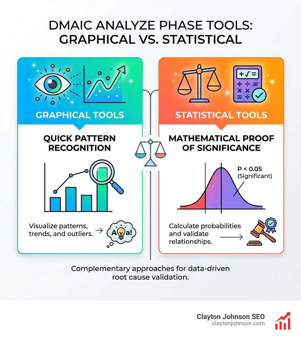
Brainstorming is great, but in Six Sigma, we don’t trust hunches. We verify. This is where we separate the subjective from the objective. We use a combination of graphical and statistical tools to provide evidence-based decisions. For those who need a deeper dive into these technicalities, our Services: Analytics & Data can help bridge the gap between raw data and strategic insight.

| Tool Category | Purpose | Examples |
|---|---|---|
| Graphical | Visualizing patterns and outliers | Pareto Charts, Histograms, Scatter Plots |
| Statistical | Providing mathematical proof | Hypothesis Testing, ANOVA, Regression |
Leveraging Graphical dmaic analyze phase tools for Pattern Recognition
Visual tools help us “see” the data. Histograms are particularly useful because Six Sigma teams often deal with large volumes of information. Instead of staring at a spreadsheet with 10,000 rows, we plot the data to see the distribution. Is it normal? Is it skewed? Are there two peaks (bi-modal), suggesting two different processes are running at once?
- Pareto Charts: These bars sorted by frequency help us apply the 80/20 rule visually.
- Scatter Plots: These reveal if two variables are related. If we increase “X,” does “Y” also go up?
- Box Plots: These are fantastic for comparing variation across different shifts, machines, or locations.
Advanced Statistical dmaic analyze phase tools for Validation
Once the graphs suggest a relationship, we use statistics to confirm it.
- Hypothesis Testing: This allows us to make statistical decisions about a population using sample data. We test the “Null Hypothesis” (no change) against the “Alternative Hypothesis.”
- ANOVA (Analysis of Variance): Used when we want to compare the means of three or more groups to see if at least one is significantly different.
- Regression Analysis: This helps us estimate the impact of one variable on another. It’s the mathematical way of saying, “If we fix this specific input, we can expect this much improvement in the output.”
Process Mapping and Waste Analysis
Sometimes the root cause isn’t a broken machine or a faulty part—it’s the process itself. We use process map maturation to take the high-level maps from the Define phase and turn them into detailed, step-by-step blueprints of reality.
In this stage, we often employ tools like Porter’s Five Forces to see how external competitive pressures might be forcing our processes into inefficient “workarounds.” We also use a SWOT Analysis to identify if our internal weaknesses are creating bottlenecks.
Identifying the Seven Classical Wastes
A core part of the Analyze phase in Lean Six Sigma is “Waste Analysis.” We look for non-value-added activities—things the customer wouldn’t want to pay for. These are often remembered by the acronym TIMWOOD:
- Transport: Moving products or information more than necessary.
- Inventory: Stockpiling work that isn’t being processed.
- Motion: Excess movement by people (walking to a printer, searching for files).
- Waiting: Idle time between process steps.
- Overproduction: Making more than is needed or making it too early.
- Over-processing: Doing more work than the customer requires (using a high-precision tool where a simple one would do).
- Defects: The cost of scrap and rework.
Avoiding Common Pitfalls and Verifying Results
The Analyze phase is arguably the most difficult because it requires extreme discipline. It is very easy to fall into the trap of confirmation bias—only looking at data that supports what you already think is the problem.
Another common pitfall is guesswork. If a team says, “We think the supplier is the problem,” but the data doesn’t show a correlation between supplier batches and defect rates, the team must move on. We also use PESTLE Analysis to ensure we aren’t overlooking macro-environmental factors like new regulations or economic shifts that might be the true “root” of our issues.
Before moving to the Improve phase, we must verify our findings. This often involves pilot testing or small-scale experiments to see if our identified root cause actually changes the outcome. The final deliverable of this phase is a verified list of root causes, backed by data, that the team is confident will move the needle.
Frequently Asked Questions about dmaic analyze phase tools
What is the primary objective of the DMAIC Analyze phase?
The primary objective is to use the data collected in the Measure phase to identify and verify the root causes of defects or process gaps. It aims to narrow down a long list of potential causes to the “vital few” that have the highest impact on the process’s performance.
Which specific root cause analysis tools are most common?
The most common dmaic analyze phase tools include the Fishbone (Ishikawa) Diagram for brainstorming, the 5 Whys for drilling down into specific issues, and FMEA for prioritizing risks. Pareto analysis is also frequently used to visualize which causes are most frequent.
How do teams verify root causes before the Improve phase?
Teams verify root causes using statistical validation methods such as Hypothesis Testing (T-tests, ANOVA), Correlation analysis, and Regression analysis. If the statistics show a significant relationship between the suspected cause and the problem, the root cause is considered verified.
Conclusion
The Analyze phase is the “bridge” of the DMAIC process. It’s where your hard work in defining and measuring finally pays off in the form of actual insight. By using the right dmaic analyze phase tools, you move from being a team that “guesses” to a team that “knows.”
Whether you are in Minneapolis or working with a global team, the principles of operational excellence remain the same: trust the data, challenge your assumptions, and never stop digging until you find the source. At Clayton Johnson, we specialize in helping businesses navigate these complex data landscapes to find the growth strategies that actually work.
If you’re ready to stop the guesswork and start scaling with precision, Work with me for Analytics and Data services today. Let’s turn your data into your greatest competitive advantage.


