How to Make a Perceptual Map (And See Your Market Clearly)
If you want to know how to make a perceptual map, here is the short answer:
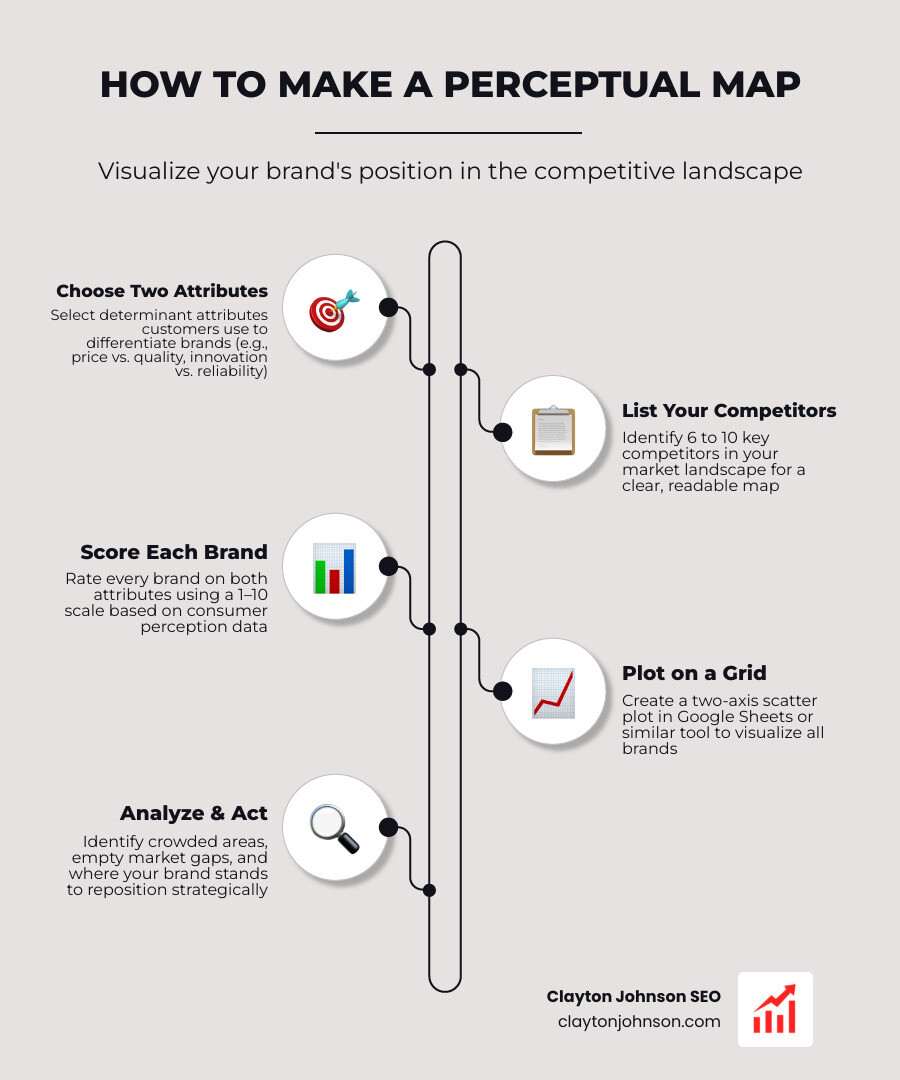
- Choose two attributes that customers actually care about (e.g., price vs. quality)
- List your competitors — aim for 6 to 10 brands
- Score each brand on both attributes using a 1–10 scale
- Plot the scores on a two-axis grid in Google Sheets or similar tool
- Analyze the map to find crowded areas, empty spaces, and where your brand stands
That is the core process. The sections below walk through each step in detail.
There is a striking disconnect hiding in most businesses: 80% of CEOs believe they deliver a superior customer experience, yet only 8% of their customers agree. That gap — between how you see yourself and how your market actually sees you — is exactly the problem a perceptual map is built to close.
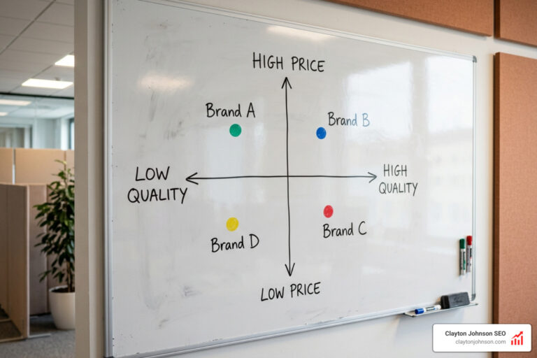
A perceptual map is a simple two-axis chart that plots your brand alongside competitors based on how customers perceive each one. It turns vague, hard-to-discuss feelings about brand positioning into a clear visual you can act on. Whether you are launching a product, planning a campaign, or trying to find an underserved market gap, this tool gives you a picture worth more than any spreadsheet of numbers.
I’m Clayton Johnson, an SEO strategist and founder of SmallBizSEO, and competitive positioning is at the core of how I help small businesses grow. Understanding how to make a perceptual map is one of the first skills I apply when helping a business figure out where they stand — and where they could win.
How to make a perceptual map word list:
What is a Perceptual Map and Why Does It Matter?
At its core, a perceptual map is a visual representation of how your target market perceives different brands, products, or services relative to each other. In the noisy world of marketing, perception is the only reality that matters. You might have the most advanced technology or the absolute best customer service in the world, but if your customers perceive you as “outdated” or “hard to work with,” that is your reality in the marketplace.
Without a clear understanding of this landscape, brands easily fall victim to commoditization. This occurs when a product is perceived by customers to be so common and interchangeable with competitors’ products that price becomes the sole distinguishing factor. A strong brand and emotional connection are your primary defenses against this race to the bottom.
Perceptual mapping is not a fleeting trend. It has been a standard marketing research tool since the 1960s, with roots in psychometric methods like multidimensional scaling developed in the 1950s. Pioneers like Wendell R. Smith and Harry Beckwith laid the groundwork, and the term “positioning” itself was later popularized by Al Ries and Jack Trout in 1969.
When you know where you stand, you can craft a strategy that actually resonates. For a deeper look into the strategy behind this, check out The Definitive Guide to Competitive Positioning. By visualizing consumer perception, you can bridge the gap between your executive team’s beliefs and customer reality. For a quick conceptual framework, you can also review this perceptual-mapping-guide to understand how these elements function in the wild.
Core Components of a Positioning Map
To build a map, you need to understand its key parts. A standard perceptual map relies on four basic elements:
- Axes: The horizontal (X) and vertical (Y) lines that cross in the middle to create four distinct quadrants. Each axis represents a spectrum of a specific customer-centric attribute.
- Attributes: The specific features, benefits, or emotional drivers (such as “modern vs. traditional” or “convenient vs. high-effort”) that influence customer decisions.
- Brands/Products: The entities you are comparing (your own brand plus your main competitors).
- Perceptions: The subjective evaluations and scores that dictate exactly where each brand is plotted on the grid.
Understanding how these components interact is key to executing a winning Market Positioning Strategy Complete Guide.
Two-Dimensional vs. Multi-Dimensional Mapping
The most common type of perceptual map is the two-dimensional (2D) map. It uses two axes to compare two primary attributes. It is highly favored in marketing because it is simple, intuitive, and immediately actionable for presentations.
However, consumer minds are rarely two-dimensional. That is where multi-dimensional mapping comes in. These advanced maps analyze three or more attributes simultaneously using statistical techniques like factor analysis or correspondence analysis. While multidimensional scaling (MDS) offers a highly nuanced and comprehensive understanding of consumer preferences, it requires specialized statistical software and is much harder to interpret at a glance.
For most businesses, starting with a 2D map is the best way to keep things clear and actionable. If you need some inspiration to get started, you can explore How to Create a Perceptual Map: Step-by-Step Guide, Tips, and Free Templates | Creately to see some classic visual layouts.
How to Choose the Right Attributes and Collect Data
A map is only as good as the data you feed it. If you choose the wrong attributes to measure, you will end up with a map that is technically accurate but strategically useless (like mapping coffee shops based on “number of letters in the brand name”).
To make your map meaningful, you must identify determinant attributes — the specific criteria that consumers actually rely upon to make their purchasing decisions and differentiate between competitive offerings.
We always recommend including 6 to 10 competitors on your map. This is the sweet spot: it is large enough to give you an accurate, comprehensive visualization of your market position, but small enough to keep the map readable and uncluttered. To gather the intelligence needed to narrow down this list, check out our guide on how to Stop Guessing And Start Positioning With Competitive Intelligence.
Once you have your competitors, you need to gather ratings using a consistent scale, such as a 1 to 10 rating scale or a semantic differential scale (e.g., rating a brand from 1 to 7 between opposing terms like “outdated” and “cutting-edge”). For a closer look at structuring these attributes, read A Step-by-step Guide to Constructing a Perceptual Map.
Selecting Determinant Attributes for Your Axes
When choosing attributes for your axes, think like your customer. What actually drives their purchase decisions?
One critical mistake to avoid is using highly correlated attributes on the X and Y axes, such as “Price” and “Quality.” Because consumers naturally associate higher prices with higher quality, plotting these together will cause all your competitors to align in a diagonal line from the bottom-left to the top-right. This renders your map strategically useless because it doesn’t show any real differentiation.
Instead, pair price with an emotional or functional attribute, or look at two entirely non-price dimensions (such as “sweetness vs. caffeine level” for drinks). For more tips on identifying these unique points of leverage, see Visualizing Your Competitive Edge With A Strategy Canvas.
Gathering and Structuring Consumer Perception Data
To get an unbiased map, you should collect data from actual customers rather than relying solely on internal boardroom assumptions. You can gather quantitative and qualitative data through:
- Customer Surveys: Ask a representative sample of your target audience to rate each brand on a scale of 1 to 10 for your chosen attributes.
- Discovery Interviews: Run qualitative interviews first to identify the exact language and dimensions buyers use before you design your survey.
- Review Mining: Analyze online reviews on Google, Yelp, or industry forums to see how people naturally describe your competitors.
Once you have this data, calculate the average score for each brand on both attributes. This gives you the clean, structured coordinates you need to build your visual map. For a comprehensive walkthrough of this data gathering phase, check out How to Create a Perceptual Map (2026 Guide).
How to Make a Perceptual Map in Google Sheets
While there are expensive, specialized tools out there, Google Sheets offers the perfect balance of ease, power, and professionalism for 90% of perceptual mapping use cases.
Using a spreadsheet allows you to quickly turn raw numbers into a presentation-ready visual. It is also an excellent collaborative tool for aligning your team. To understand how this fits into your broader competitive analysis, see Surveying The Field With A Competitive Landscape Map.
To learn the technical fundamentals of setting up your spreadsheet, you can review How to Make a Perceptual Map in Google Sheets.
Setting Up Your Data Table: How to Make a Perceptual Map
To build a clean perceptual map in Google Sheets, you need to structure your data table correctly. Create a simple table with four columns:
- Brand Name: The list of your 6 to 10 competitors (and your own brand).
- X-Axis Score: The average customer perception score for your first attribute (e.g., 1 to 10).
- Y-Axis Score: The average customer perception score for your second attribute (e.g., 1 to 10).
- Bubble Size: A uniform value (like “5”) for all brands to ensure visual consistency, unless you want to use actual market share or sales volume to scale the size of each bubble.
If you are stuck on brainstorming attributes or need help generating a plausible starter dataset, you can read How to Make a Perceptual Map in Google Sheets Using ChatGPT to see how to use AI as a creative assistant.
Step-by-Step Chart Creation: How to Make a Perceptual Map in Google Sheets
Once your data is entered, follow these steps to generate and customize your chart:
- Highlight your data range (including the headers) and click Insert > Chart.
- In the Chart Editor on the right, change the Chart Type to Bubble Chart. (We highly recommend a bubble chart over a scatter plot because it allows you to display brand names directly on the data points rather than relying on a cluttered legend).
- Under the Customize tab, go to Series and check the box for Apply to all series. Enable Data Labels and set the label type to your “Brand Name” column.
- Set the Legend to “None” to keep the chart clean.
- Go to the Horizontal Axis and Vertical Axis settings and manually set the Min value to
0and Max value to11(for a 1–10 scale). This adds breathing room so your bubbles don’t get cut off at the edges. - Under Gridlines and Ticks, select your axes and add a Major Tick at your scale’s midpoint (e.g.,
5.5). This acts as a workaround to draw clean horizontal and vertical lines that divide your chart into four equal quadrants.
Here is a quick comparison of why we prefer a bubble chart over a standard scatter plot for this process:
| Feature | Bubble Chart (Recommended) | Scatter Plot |
|---|---|---|
| Data Labeling | Labels can be placed directly on the bubble | Often requires a separate, hard-to-read legend |
| Third Dimension | Can scale bubble size by market share or sales | Limited strictly to X and Y coordinates |
| Visual Clarity | Highly intuitive for presentation slides | Can look cluttered when many points overlap |
Analyzing Your Map to Uncover Strategic Market Gaps
Now that your map is built, it is time for the most exciting part: finding the strategic opportunities. A completed perceptual map is a visual diagnostic tool of your competitive environment.
When you look at your completed map, pay close attention to three main areas:
- Whitespace Analysis: Look for “empty spaces” on the map. These represent combinations of attributes that are currently unaddressed by any competitor. However, beware of the empty gap trap — some gaps are empty because they are economically unviable or because there is zero customer demand for that specific combination.
- Crowded Areas: Clusters of multiple brands in one quadrant indicate intense competition. If you are sitting in a crowded cluster, you will face heavy competitive pressure. To understand how to navigate this, check out our insights on How To Think About Competitive Pressure.
- Perception Gaps: Compare your intended positioning with where customers actually plotted you. If you think you are a premium, high-value brand but customers have plotted you as a budget, low-quality option, you have a major brand repositioning challenge ahead.
By analyzing these quadrants objectively and avoiding internal boardroom bias, you can use these insights to guide your product development, marketing campaigns, and SEO positioning.
Frequently Asked Questions about Perceptual Mapping
How many competitors should be included on a perceptual map?
For the best results, aim for 6 to 10 competitors. Including fewer than 5 brands might give you an incomplete view of the competitive landscape, while including more than 10 can make the visual map cluttered and difficult to read in presentations.
Why shouldn’t you use price and quality on the same map?
Price and quality are highly correlated in the minds of most consumers. When you plot them together, almost all brands will naturally fall along a diagonal line (low price/low quality to high price/high quality). This fails to reveal unique positioning opportunities or distinct market niches, making the map strategically useless.
How often should you update your perceptual map?
For most stable industries, an annual update is ideal. However, if you operate in a fast-moving market, have recently launched a major brand repositioning campaign, or have seen new competitors enter the space, you should update your map quarterly or bi-annually to track shifting customer sentiments.
Conclusion

Learning how to make a perceptual map is one of the most powerful steps you can take to remove guesswork from your brand strategy. It forces you to step out of your own assumptions, look at the market through your customers’ eyes, and identify the clear “whitespace” opportunities where your brand can truly stand out.
At Clayton Johnson SEO, we help companies map and understand their target audiences through strategic content and data-driven SEO services. We know that real search visibility starts with precise, strategic positioning.
If you are ready to stop guessing and start claiming your niche, explore our guide on how a Competitive Positioning Map Demystified can work for your business. Let us help you map your path to the top.